New! Browsable Podcast Charts Hub
We’re excited to bring you yet another major update to podcast charts on Podchaser. Introducing Podchaser’s podcast charts discovery hub!
The innovative podcast charts hub sets a new standard for podcast discovery. It also represents another step forward for podcast data democratization, one of Podchaser’s primary missions.
And in case you missed our last charts overhaul, read it here: Podcast Charts for All
Okay, enough pomp and circumstance. Let’s unveil the browsable podcast charts hub experience and explore how it’ll be your new favorite podcast discovery tool.
Browsable Podcast Charts Hub Deep Dive
First, how do you get to the podcast charts hub?
Under the ‘Podcasts’ navigation menu, you’ll see an icon for “Charts.” Click it!
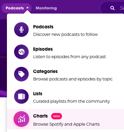
That’ll bring you to the beautiful, browsable podcast charts discovery hub.
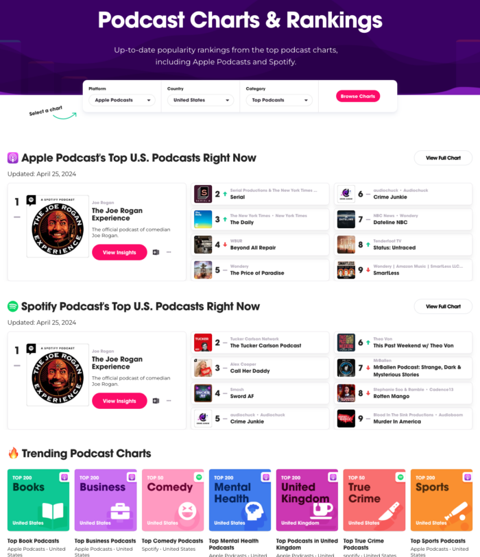
Here she is…
What’s next? Let’s go step-by-step:
Select a chart to begin! You can filter by:
- Platform (Apple Podcasts or Spotify Podcasts)
- Country (literally every country Apple/Spotify include)
- Category (as defined by Apple/Spotify podcast charts)
After filtering, all you need to do is smash that pink “Browse Charts” button to see results.
Don’t have anything specific in mind? No problem! The next section shows you the Top 9 podcasts right now on both Apple Podcasts and Spotify Podcasts.
And then? Trending podcast charts! Featuring fun, discovery-themed cover art.
Whew, we’re not done yet. Further down the charts hub, here’s what you’ll find:
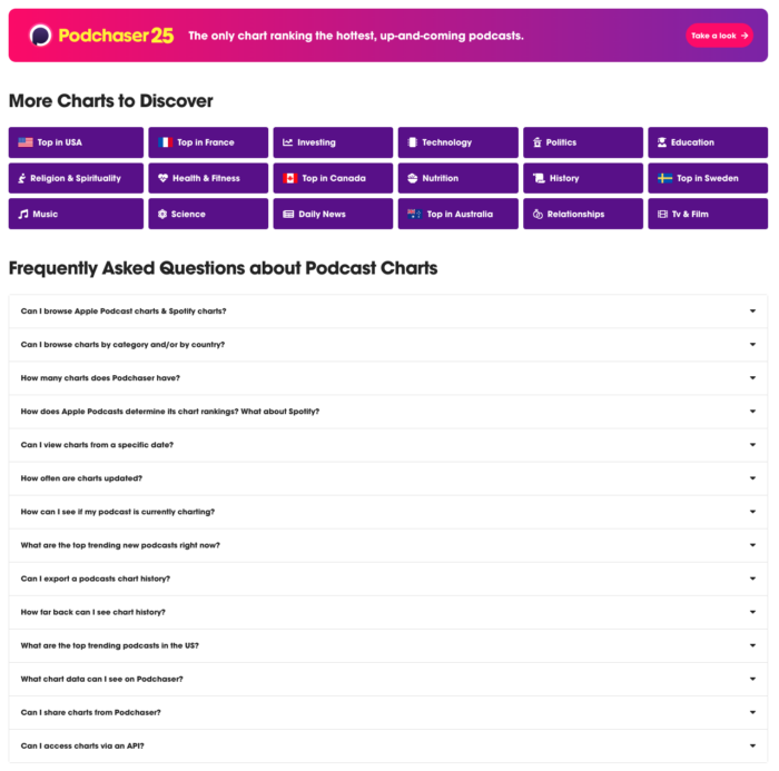
Podchaser 25! Bolstered by data partnerships with top listening apps, Podchaser provides a first-of-its-kind snapshot of the top 25 hottest, up-and-coming podcasts.
Brands, agencies, and publishers can now identify trending new podcasts that are gaining rapid popularity to surface new business opportunities, including advertising, content acquisition, cross-promotion, trend analysis, and much more.
Then you’ll find another section dedicated to interesting charts.
And finally, the podcast charts hub closes out with a robust FAQ section guaranteed to answer every question you have about charts.
Now let’s look at chart browsing experience.
Podcast Chart Browsing Experience
Once you click on a chart, you’ll enter the new ‘Browse Charts’ view.
Here’s what it looks like:
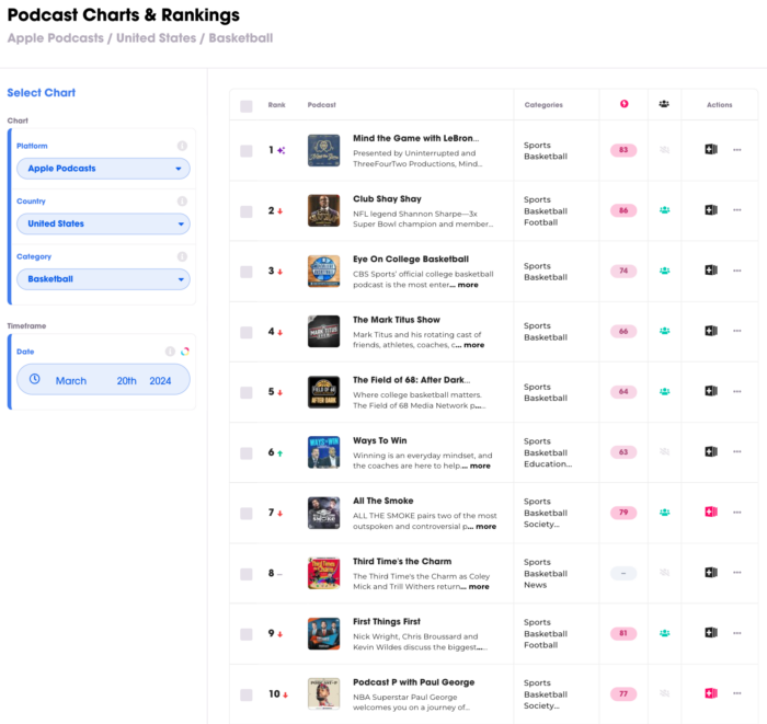
Indicators show you the podcasts’ rank changes from the previous day:
- Green “Up” arrow means improved
- Red “Down” arrow means decreased
- Gray Line means no change
- Purple sparkle means it’s new to the chart
You might’ve noticed the “timeframe” section along the left rail. It’s awesome, but only available to Podchaser Pro users.
Pro users can see charts data up to 90 days, historically. Need it? Want it? Gotta have it? Request a demo here: Podchaser Pro Demo
Final Thoughts on Browsable Podcast Charts
Charts are an amazing podcast discovery tool. And now that they’re available via Podchaser’s charts discovery hub, you can stop toggling between Apple/Spotify in order to find your next fav show.
And if you’re a brand, agency, or network and want to see how browsable charts will enrich your commercial use case, let’s chat!
Unlock more with Podchaser Pro
- Audience Insights
- Contact Information
- Demographics
- Charts
- Sponsor History
- and More!

- Account
- Register
- Log In
- Find Friends
- Resources
- Help Center
- Blog
- API
Podchaser is the ultimate destination for podcast data, search, and discovery. Learn More
- © 2024 Podchaser, Inc.
- Privacy Policy
- Terms of Service
- Contact Us